Component Library
Browse and explore components
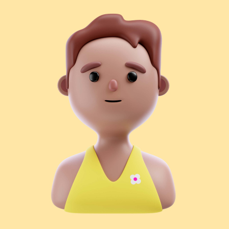
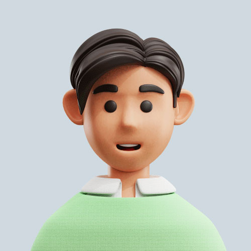
Avatar
An Avatar is a UI component used to represent a user with an image, icon, or initials.
Default Avatar


Component Code
Copy Code
import { Avatar } from 'flowbite-react'

const DefaultAvatarCode = () => {
  return (
    <div>
      <div className='flex flex-wrap gap-2'>
        <Avatar img='/images/profile/user-2.jpg' rounded />
        <Avatar img='/images/profile/user-3.jpg' />
      </div>
    </div>
  )
}

export default DefaultAvatarCode
Border Avatar
Component Code
Copy Code
import { Avatar } from 'flowbite-react'

const BorderAvatarCode = () => {
  return (
    <div>
      <div className='flex flex-wrap gap-2'>
        <Avatar img='/images/profile/user-2.jpg' rounded bordered />
        <Avatar img='/images/profile/user-3.jpg' bordered />
      </div>
    </div>
  )
}

export default BorderAvatarCode
Placeholder Avatar
Component Code
Copy Code
import { Avatar } from 'flowbite-react'

const PlaceholderAvatarCode = () => {
  return (
    <div>
      <div className='flex flex-wrap gap-2'>
        <Avatar />
        <Avatar rounded />
      </div>
    </div>
  )
}

export default PlaceholderAvatarCode
Placeholder Initials
RR
RR
Component Code
Copy Code
import { Avatar } from 'flowbite-react'

const IntitalAvatarCode = () => {
  return (
    <div>
      <div className='flex flex-wrap gap-2'>
        <Avatar placeholderInitials='RR' />
        <Avatar placeholderInitials='RR' rounded />
      </div>
    </div>
  )
}

export default IntitalAvatarCode
Dot indicator
Component Code
Copy Code
import { Avatar } from 'flowbite-react'

const DotIndicatorCode = () => {
  return (
    <div>
      <div className='flex flex-wrap gap-2'>
        <Avatar img='/images/profile/user-2.jpg' status='online' />
        <Avatar
          img='/images/profile/user-3.jpg'
          rounded
          status='busy'
          statusPosition='top-right'
        />
        <Avatar
          img='/images/profile/user-4.jpg'
          status='offline'
          statusPosition='bottom-left'
        />
        <Avatar
          img='/images/profile/user-5.jpg'
          rounded
          status='away'
          statusPosition='bottom-right'
        />
      </div>
    </div>
  )
}

export default DotIndicatorCode
Override Image
Component Code
Copy Code
import { Avatar } from 'flowbite-react'
import Image from 'next/image'

const ImageOverrideCode = () => {
  return (
    <div>
      <div className='flex flex-wrap gap-2'>
        <Avatar
          img={(props) => (
            <Image
              alt=''
              height='48'
              referrerPolicy='no-referrer'
              src='/images/profile/user-2.jpg'
              width='48'
              {...props}
            />
          )}
        />
        <Avatar
          img={(props) => (
            <picture>
              <source
                media='(min-width: 900px)'
                srcSet='/images/profile/user-2.jpg'
              />
              <source
                media='(min-width: 480px)'
                srcSet='/images/profile/user-1.jpg'
              />
              <Image
                alt=''
                height='48'
                src='/images/profile/user-1.jpg'
                width='48'
                {...props}
              />
            </picture>
          )}
        />
      </div>
    </div>
  )
}

export default ImageOverrideCode
Avatar With Text
Jese Leos
Joined in August 2014
Component Code
Copy Code
import { Avatar } from 'flowbite-react'

const AvatarWithTextCode = () => {
  return (
    <div>
      <Avatar img='/images/profile/user-2.jpg' rounded className='justify-start'>
        <div className='space-y-1 font-medium dark:text-white'>
          <div className='text-ld'>Jese Leos</div>
          <div className='text-sm text-darklink'>Joined in August 2014</div>
        </div>
      </Avatar>
    </div>
  )
}

export default AvatarWithTextCode
Colors
Component Code
Copy Code
import { Avatar } from 'flowbite-react'

const ColorAvatarCode = () => {
  return (
    <div>
      <div className='flex flex-col gap-5'>
        <div className='flex flex-wrap gap-2'>
          <Avatar
            img='/images/profile/user-5.jpg'
            rounded
            bordered
            color='gray'
          />
          <Avatar
            img='/images/profile/user-5.jpg'
            rounded
            bordered
            color='light'
          />
          <Avatar
            img='/images/profile/user-5.jpg'
            rounded
            bordered
            color='purple'
          />
          <Avatar
            img='/images/profile/user-5.jpg'
            rounded
            bordered
            color='success'
          />
          <Avatar
            img='/images/profile/user-5.jpg'
            rounded
            bordered
            color='pink'
          />
        </div>
        <div className='flex flex-wrap gap-2'>
          <Avatar img='/images/profile/user-5.jpg' bordered color='gray' />
          <Avatar img='/images/profile/user-5.jpg' bordered color='light' />
          <Avatar img='/images/profile/user-5.jpg' bordered color='purple' />
          <Avatar img='/images/profile/user-5.jpg' bordered color='success' />
          <Avatar img='/images/profile/user-5.jpg' bordered color='pink' />
        </div>
      </div>
    </div>
  )
}

export default ColorAvatarCode
Stacked layout

Component Code
Copy Code
import { AvatarGroup, Avatar } from 'flowbite-react'

const StackLayoutCode = () => {
  return (
    <div>
      <div className='flex flex-col flex-wrap gap-5'>
        <AvatarGroup>
          <Avatar img='/images/profile/user-2.jpg' rounded stacked />
          <Avatar img='/images/profile/user-3.jpg' rounded stacked />
          <Avatar img='/images/profile/user-4.jpg' rounded stacked />
          <Avatar img='/images/profile/user-5.jpg' rounded stacked />
          <Avatar img='/images/profile/user-6.jpg' rounded stacked />
        </AvatarGroup>
        <AvatarGroup>
          <Avatar img='/images/profile/user-2.jpg' rounded stacked />
          <Avatar img='/images/profile/user-3.jpg' rounded stacked />
          <Avatar img='/images/profile/user-4.jpg' rounded stacked />
          <Avatar img='/images/profile/user-5.jpg' rounded stacked />
        </AvatarGroup>
      </div>
    </div>
  )
}

export default StackLayoutCode
Avatar Sizes
Component Code
Copy Code
import { Avatar } from 'flowbite-react'

const SizeAvatarCode = () => {
  return (
    <div>
      <div className='flex flex-wrap items-center gap-2'>
        <Avatar img='/images/profile/user-5.jpg' size='xs' />
        <Avatar img='/images/profile/user-5.jpg' size='sm' />
        <Avatar img='/images/profile/user-5.jpg' size='md' />
        <Avatar img='/images/profile/user-5.jpg' size='lg' />
      </div>
    </div>
  )
}

export default SizeAvatarCode
API ( Avatar )
| Prop | Description | Type | Default |
|---|---|---|---|
img | Specifies the image URL for the avatar. | string | - |
alt | Provides alternative text for the avatar image, enhancing accessibility. | string | - |
rounded | Applies rounded corners to the avatar. | boolean | false |
bordered | Adds a border around the avatar. | boolean | false |
color | Sets the background color of the avatar when no image is provided. | 'gray' | 'light' | 'purple' | 'success' | 'pink' | gray |
placeholderInitials | To show the user initials. | string | - |
status | Displays a status indicator on the avatar. | 'online' | 'offline' | 'away' | 'busy' | - |
stacked | Stacks multiple avatars by overlapping them. | boolean | false |
size | Sets the size of the avatar. | 'xs' | 'sm' | 'md' | 'lg' | 'xl' | md |